Kinescope
Art Direction · Brand Identity · Web Design
Brand from Scratch
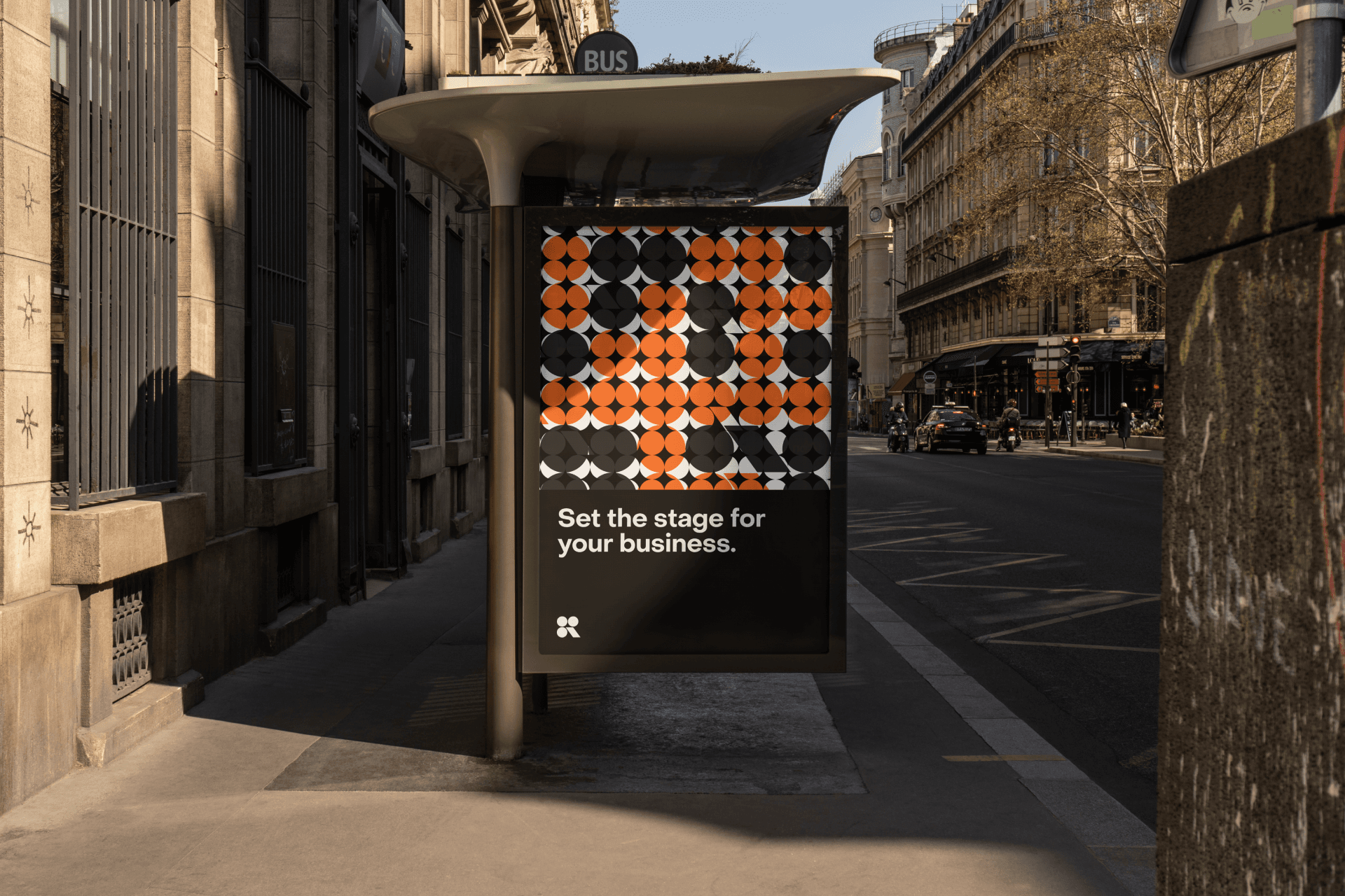
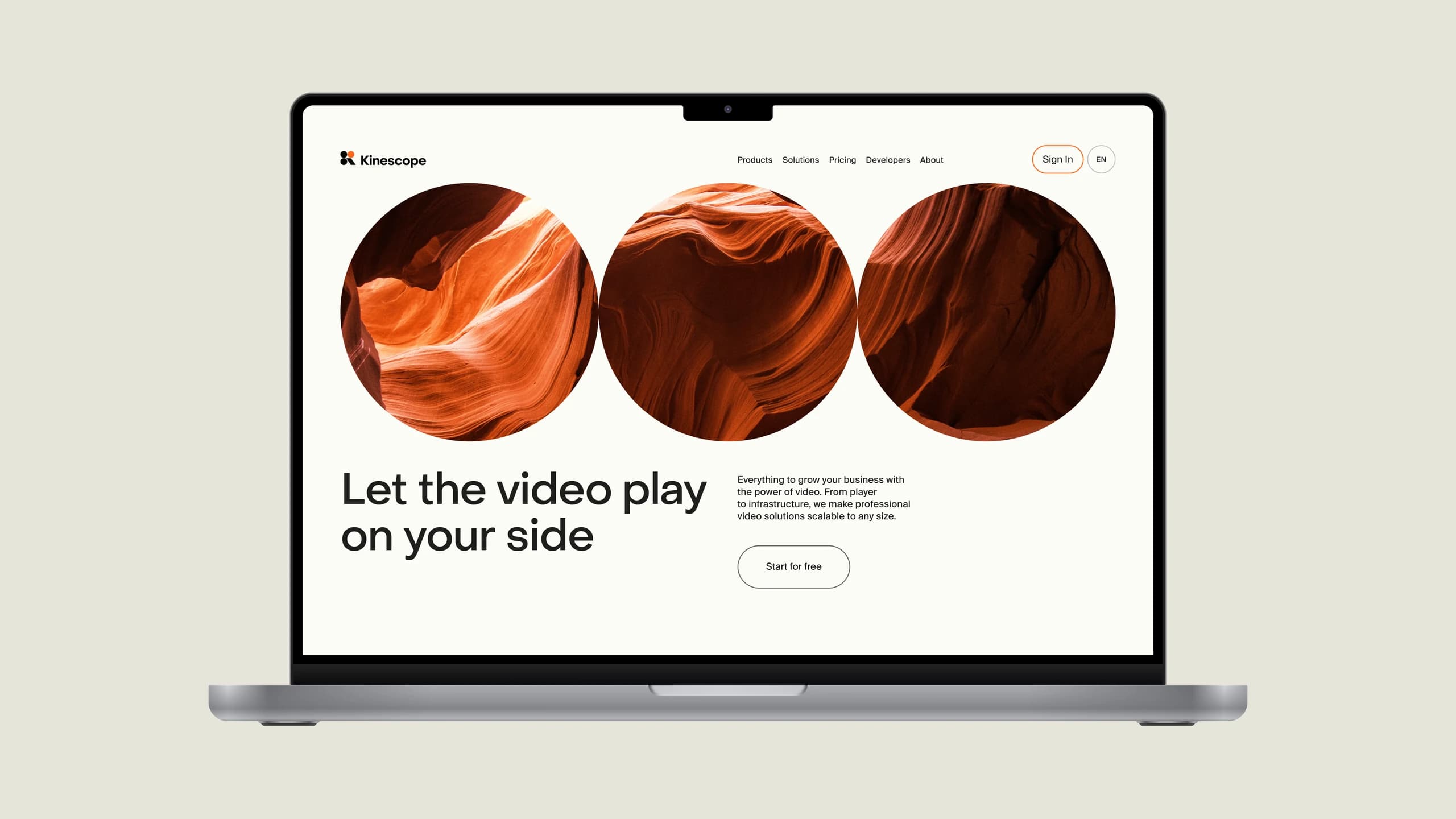
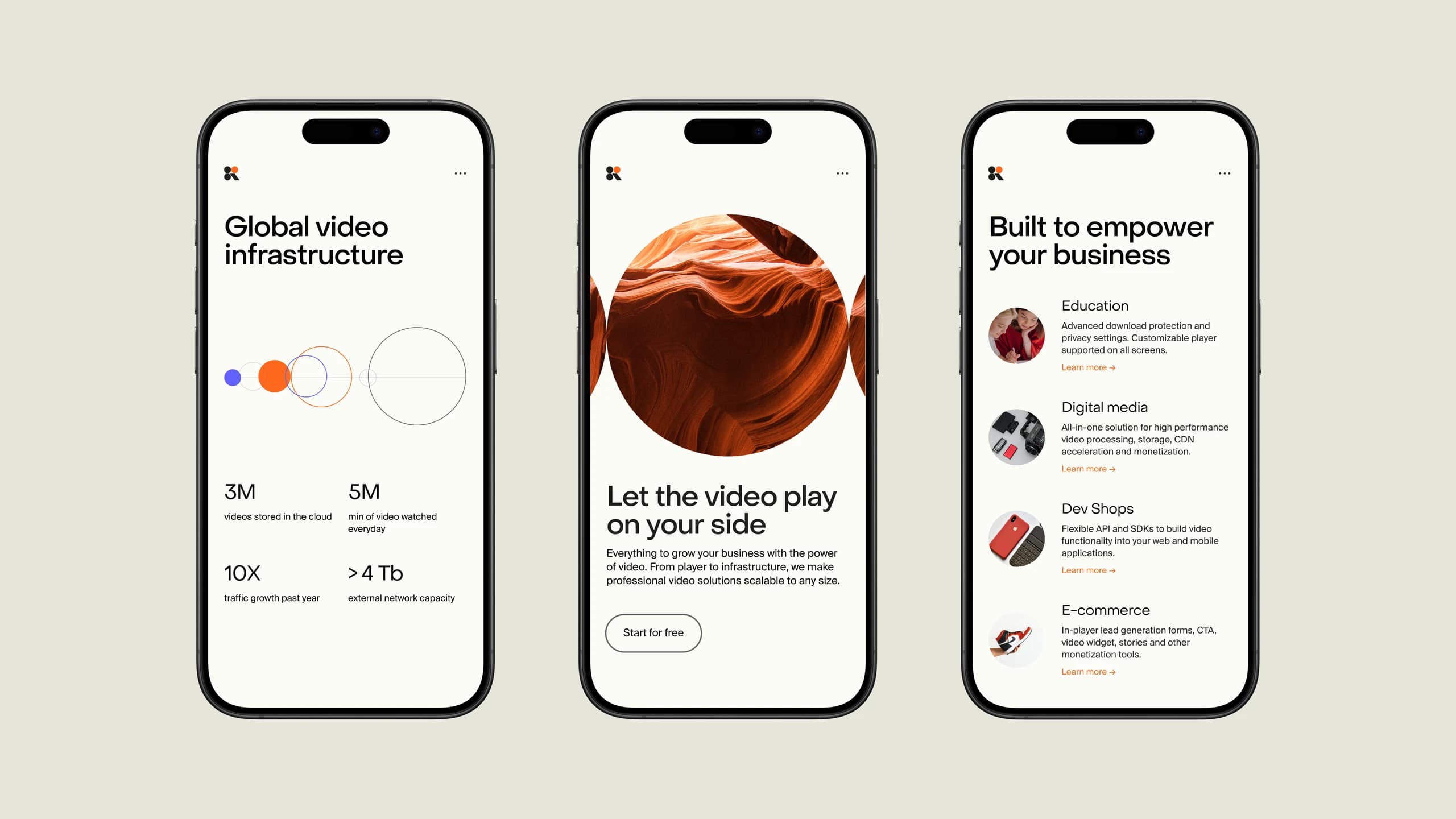
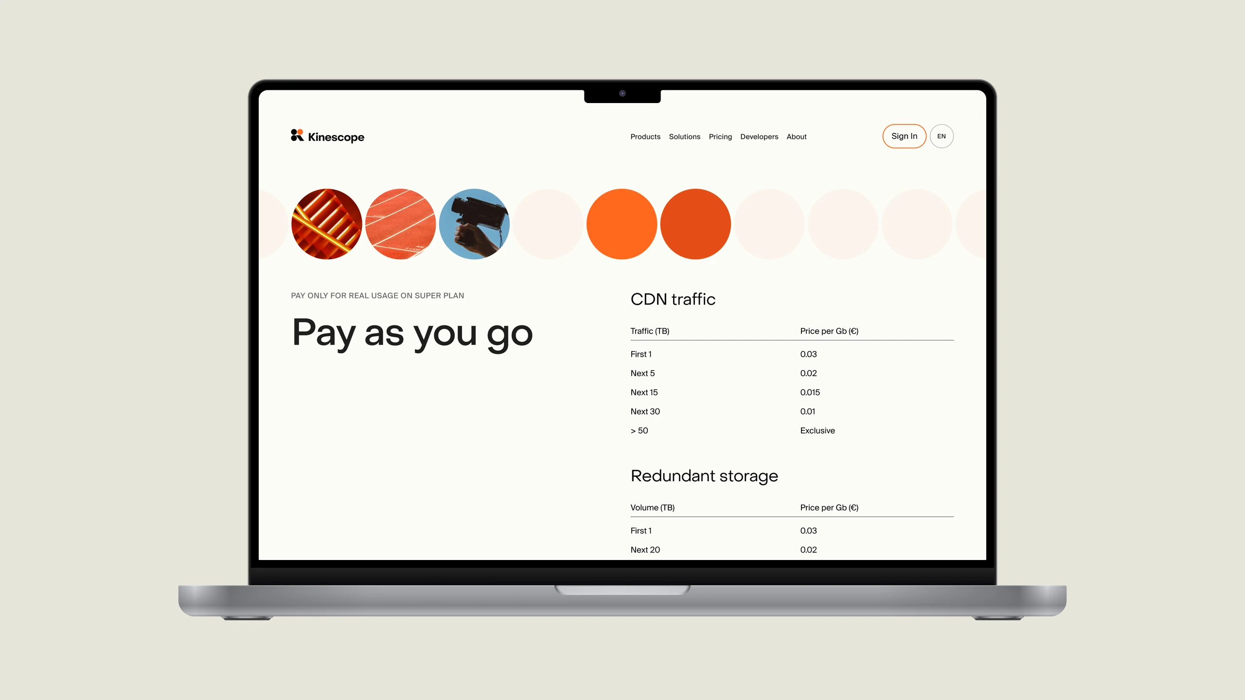
Kinescope is a seamless and affordable video hosting platform for businesses. In 2021, while at Embacy, I worked on conceptualizing and crafting its brand identity and marketing website from the ground up.
My role covered art direction, brand identity, logo and web design. The goal was an identity that could position Kinescope as an indispensable tool for businesses of all sizes.
Insights
2021
Year of the project at Embacy
4
Disciplines: art direction, brand identity, logo, web design
The Three Dots
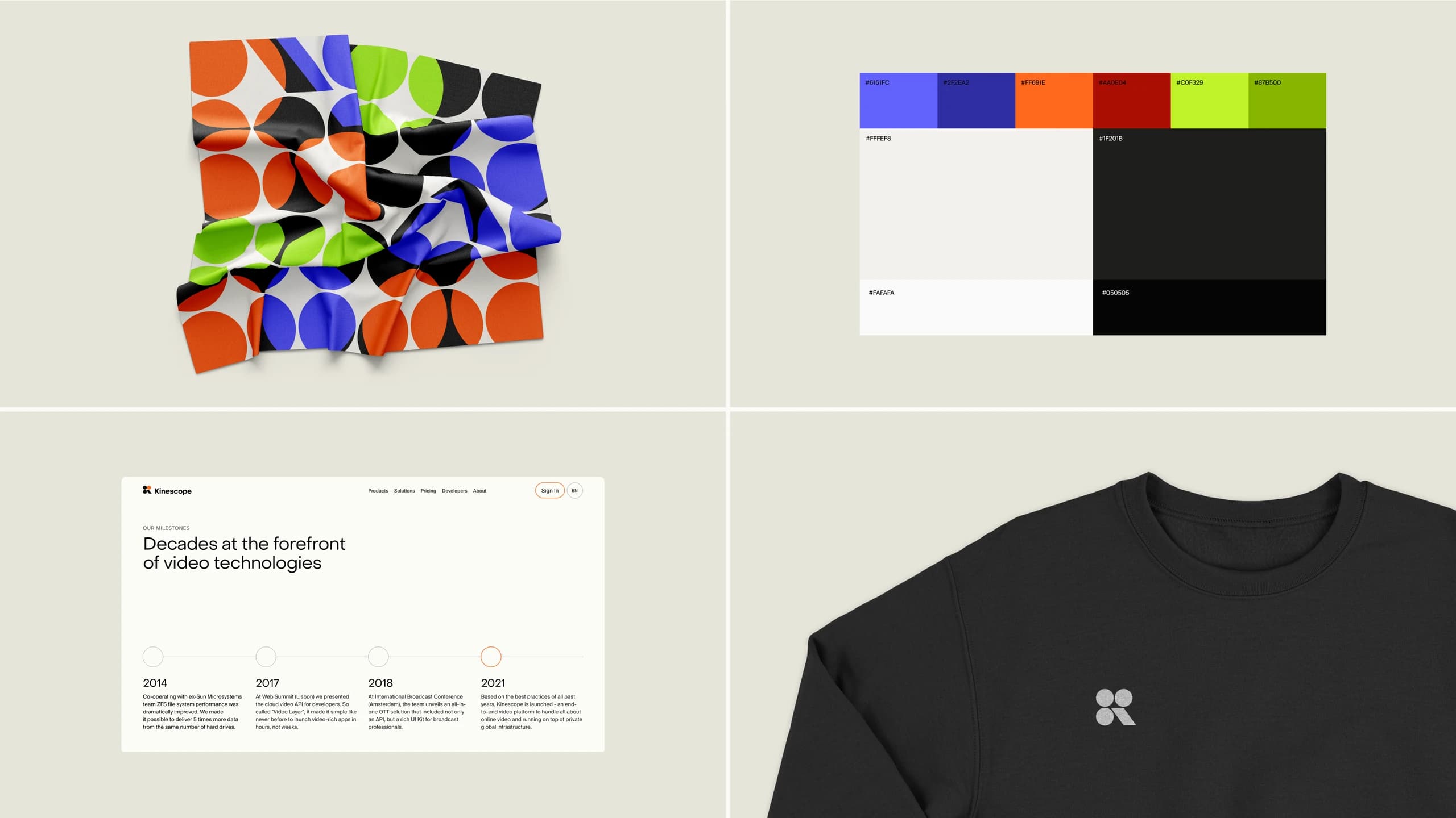
The concept comes from the mechanics of video playback. A kinescope converts electrical signals into light through three RGB channels, and the identity turns that into a symbol of three dots.
The dots converge into a dynamic play symbol, like a video player in motion. Patterns and shapes derived from the three dots suggest versatility and adaptability. I grounded the identity in the literal mechanism of the product rather than an abstract mark.
Insights
3
Dots, one for each RGB channel

Recognition
Since launch the project has been recognized for its approach to video hosting branding. It was selected for Best Of Behance.
It was also featured by the World Brand Design Society, which covered the brand identity and website created at Embacy.
Insights
Behance
Best Of Behance selection
Featured
By the World Brand Design Society